Applies To: ■ PoliteMail Desktop ■ PoliteMail Online ■ PMUA □ PoliteMail M365
Version: ■ 4.9 ■ 5.0 ■ 5.1+
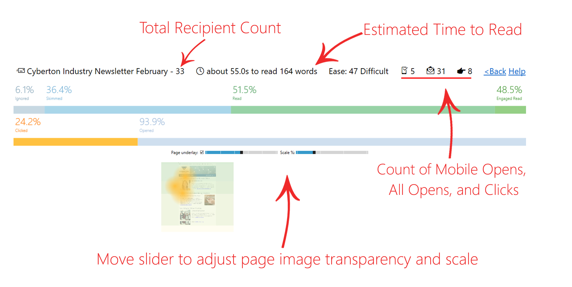
Like a weather map for your email message, PoliteMail will provide a colored overlay which shows read time and click metrics visually. This data can be used to see how your readers are viewing your content, and where you should be putting key messages and links.
The Heat Map can be useful in viewing which parts of your emails are most engaging and receive the most clicks, as well as determining the best length for an email.
Version 4.9x: The Heat Map feature must be enabled use it. If you are an on-premise client, go to PoliteMail Management Console > Advanced and set UseHeatMap to “True”. The Heat Map feature should now be available to all users. If you are a Cloud client, please contact serversupport@politemail.com to enable this feature.
Generating a Heat Map
The Heat Map feature is available with Beefree messages starting with version 5.45 of PoliteMail, if the EnableStoreSentMessage setting is set to TRUE by your Administrator. Messages composed using Beefree in earlier versions of PoliteMail are not supported.
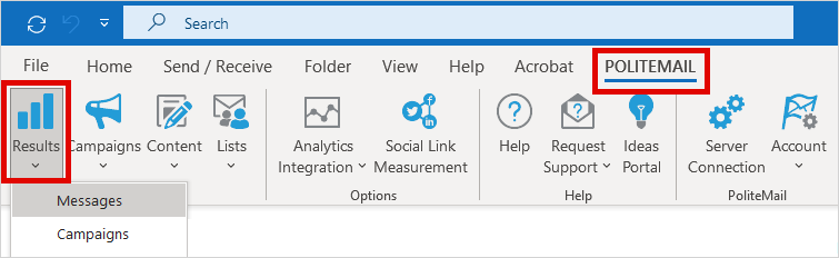
To generate a Heat Map for an existing or new message, navigate to PoliteMail > Results > Messages. If you are using PoliteMail online, go to the Navigation Pane > Results > Messages.
Double click on a message in the Message Grid view to open an Email Metrics report.
Version 5.0: The View Heat Map icon is in the right-hand corner. Click on the icon and PoliteMail will generate a Heat Map. This may take a few moments. You can also single-click the message, and then click the Actions pull-down menu and choose View Heat map.
Version 4.9x: Go to any data column, and click the small arrow to the right to see the pull-down menu. Go to Columns > HeatMap to display the HeatMap column. You can also double-click on a message in the Message Grid View, which will bring you to an Email Metrics report. The HeatMap icon in the right-hand corner.
Reading Heat Map metrics
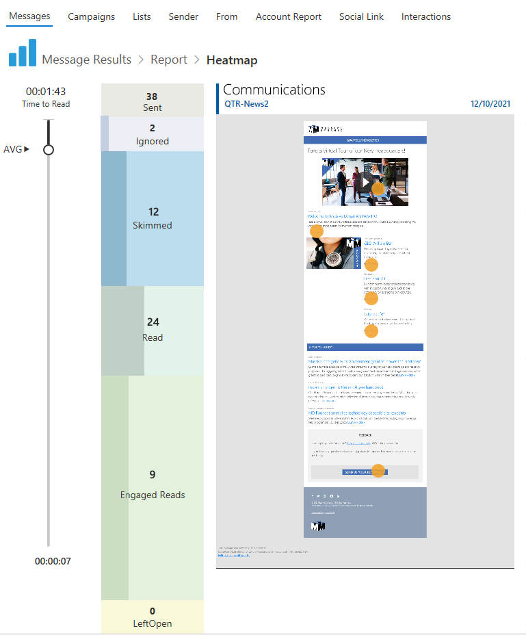 The Heat Map will display the message contents with the Heat Map overlay, as well as orange circles showing click metrics.
The slider on the left displays the estimated average read time for this email message. By moving the slider, you can see how much of the email message a reader will have read based on the average time spent on the message.
Ideally, you’d like to have your email be mostly green. The Heat Map can be useful in viewing which parts of your emails are most engaging and receive the most clicks, as well as determining the best length for an email.
The Heat Map for Version 4.9x is formatted differently, as shown below.